Case study · Type design · IDC School of Design, IIT Bombay
Interlocking देवनागरी
A display typeface where letters make room for each other — and the two-semester search for the rules that let them. My M.Des thesis, guided by Prof. Girish Dalvi.
The itch: every other script had a way in
Latin has a whole genre of interlocking display type. Arabic calligraphy has been doing it for eight centuries. Devanagari — one of the most-used scripts on earth — had beautiful one-offs, and no written rules.
The references were everywhere once I started looking. Shiva Nallaperumal's Calcula generates over 6,000 interlocking sets by manipulating letters around just five "intruder" glyphs. Square Kufic has filled mosque walls since the 12th century, black and white balanced so tightly that no gap exceeds one square. Diwani Jali interlaces a whole sentence into one-piece artwork.
And in Devanagari? S.M. Wadisherla's lettering interlocked, maybe without meaning to. Ranjana script's Kutakshar monograms stack letters by defined rule. Sign painters on Indian streets had been overlapping wide letterforms for decades. The instinct existed everywhere. The system didn't.
"In interlocking fonts, the glyphs allow the font to visually manifest as ornamentation, pattern, or a means to save space — achieved by glyphs being overlapped, fitted like a jigsaw, or following a grid."
The working definition I distilled from the research — the brief I gave myselfFifteen ways to interlock a script
Before choosing an answer, I wanted the whole question. So I drew — one word at a time, each word a different theory of how Devanagari letters could share space.
Plump overlapping forms. Vertical stacking borrowed from old conjuncts. A jigsaw of diagonals. Kufic mazes. Ornamented iron gates. Letters written sideways for narrow streets. Each sketch got its own system-of-interlocking, because a pretty word without rules is lettering, not type.
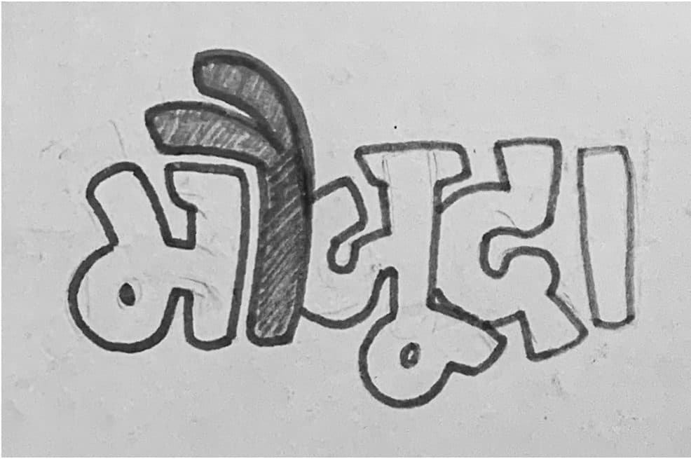
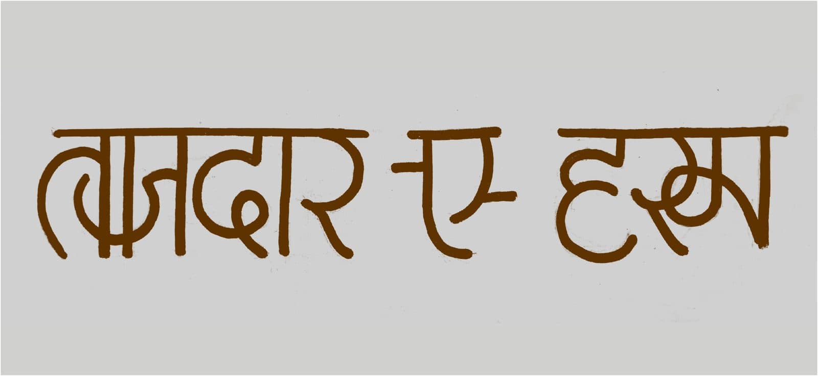
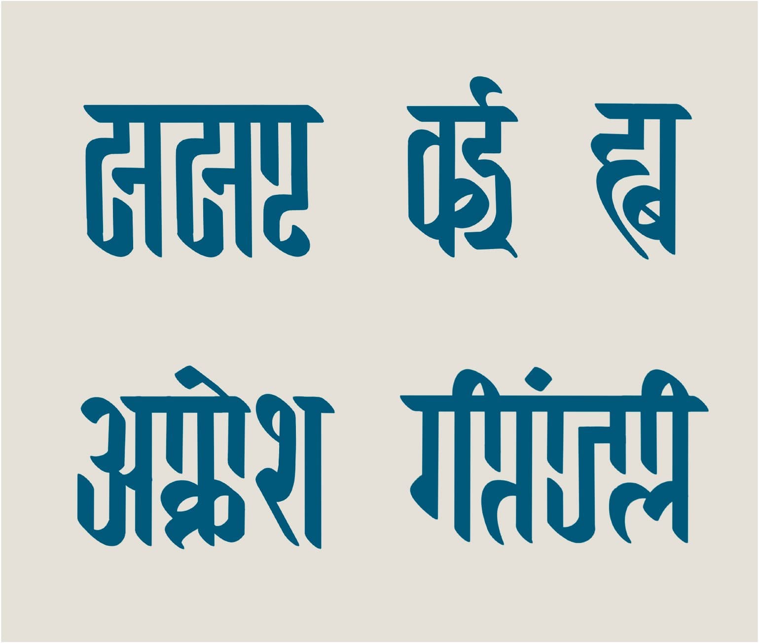
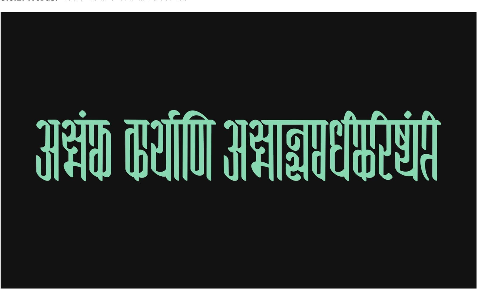
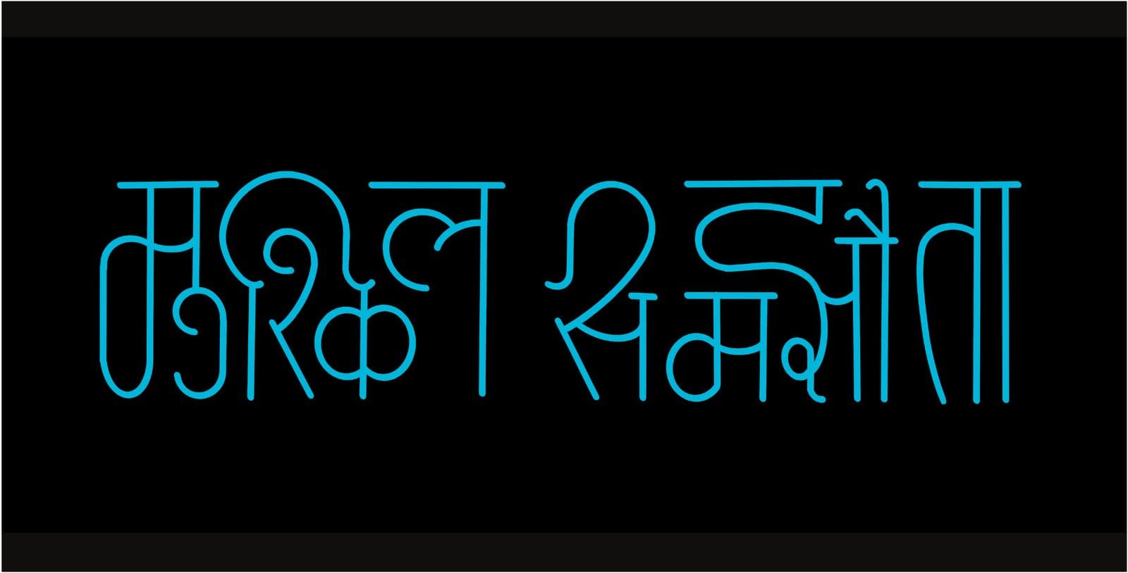
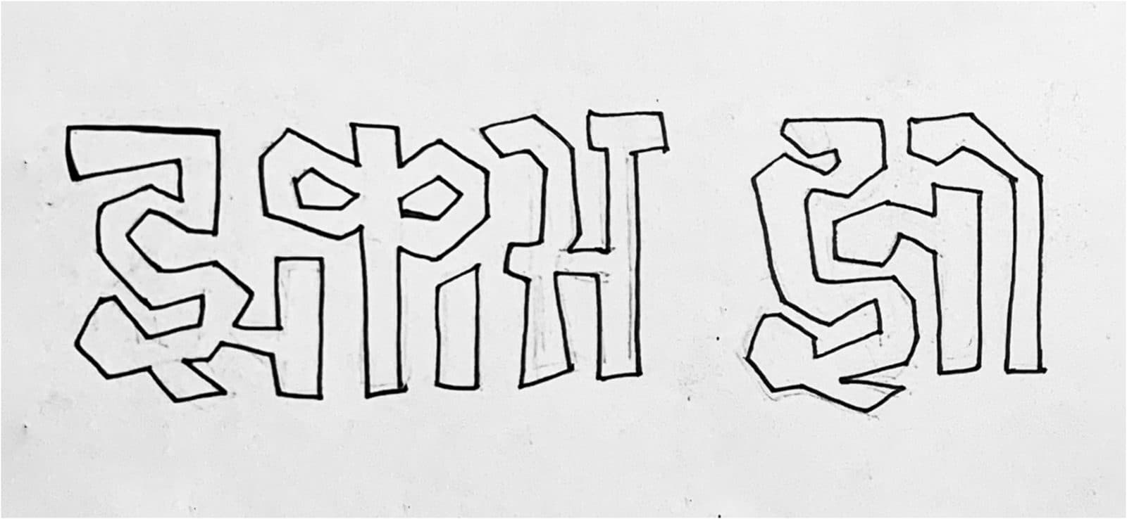
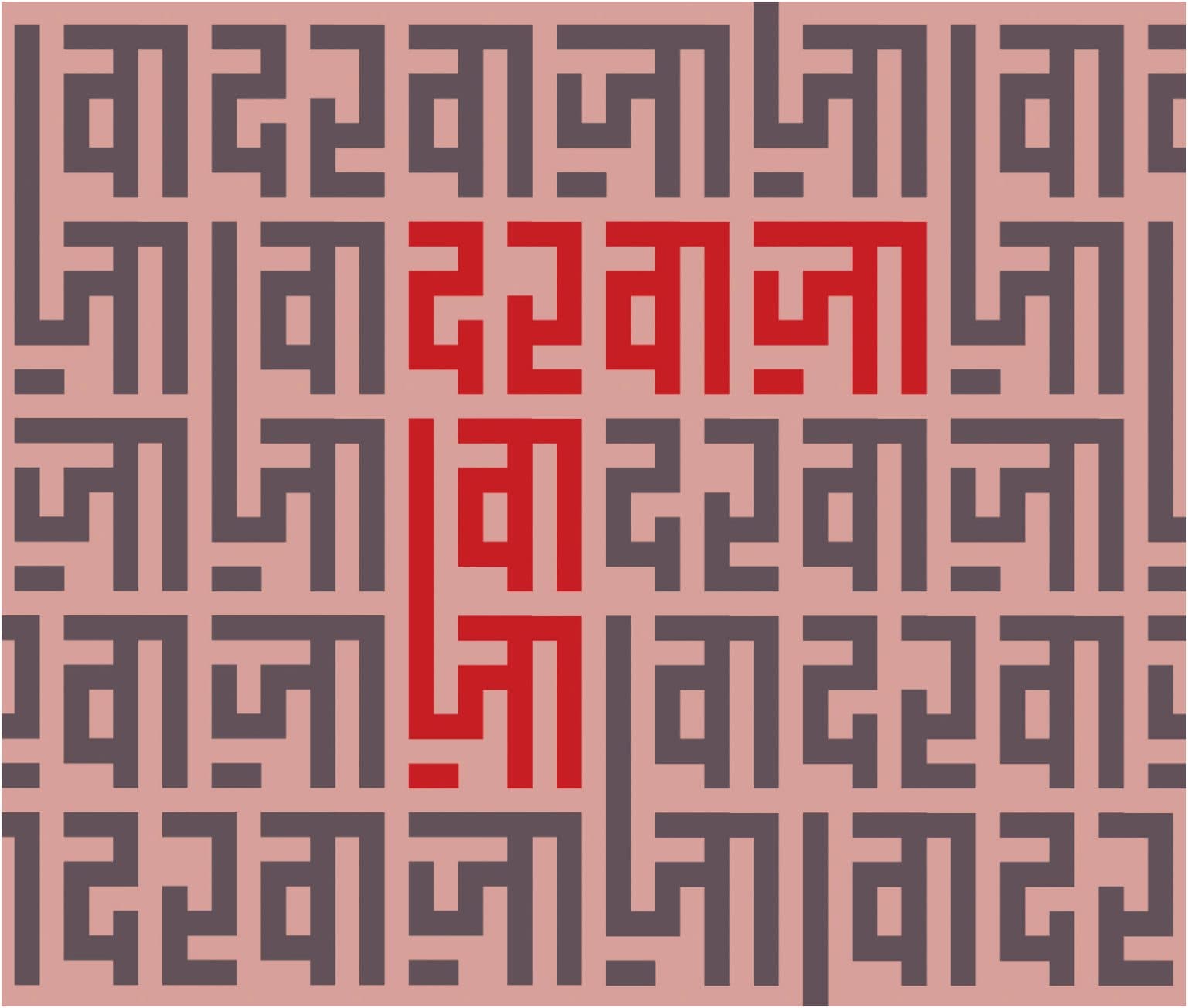
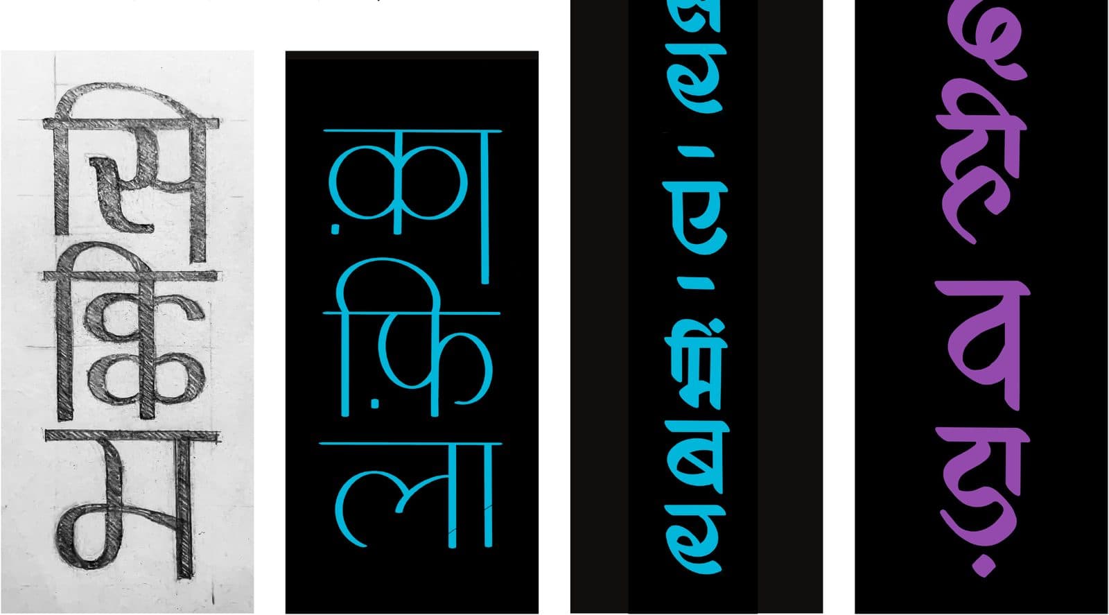
Feedback came from my guide, colleagues, and Noopur Datye of Ektype. The advice that stuck: execution defines how good a style is — the choice of style is a small part of it. Eliminate what can't work, then pick what you want to live with. One sketch kept pulling.
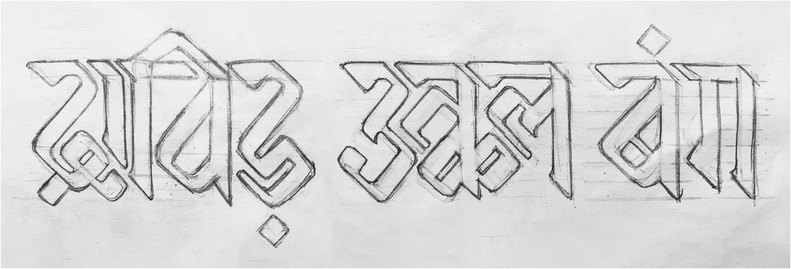
The first font — and the honest jury
Project II turned the jigsaw sketch into a working display face. It also taught me the most useful lesson of the whole thesis — by failing in a very specific way.
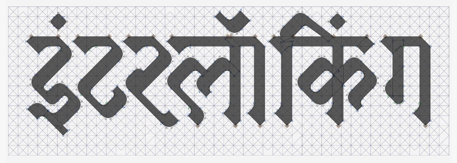
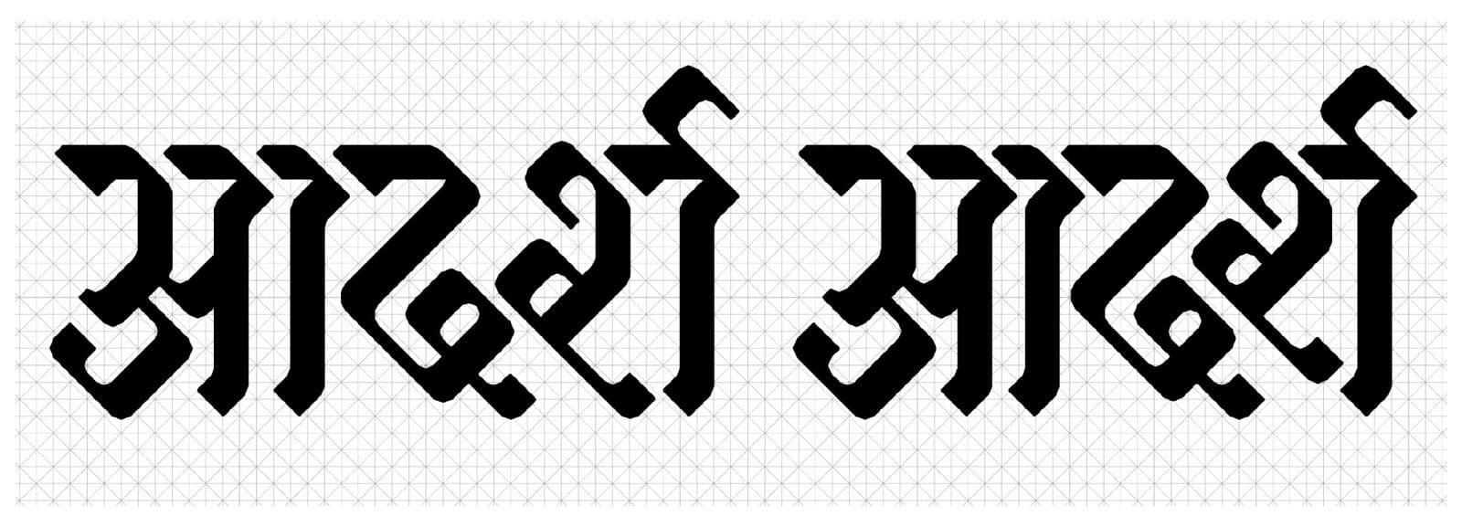
The letterforms found their skeleton on Otl Aicher's 1972 Olympic pictogram grid — the diagonals and triangles fell into it almost on their own. From there: modulated strokes, Art Nouveau-ish languid joins, stylised tails, heavy wedges to balance the whitespace, chiselled kana.
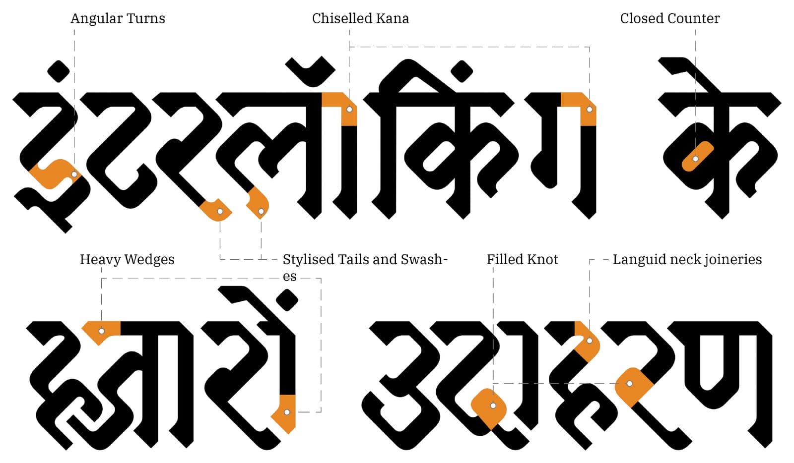
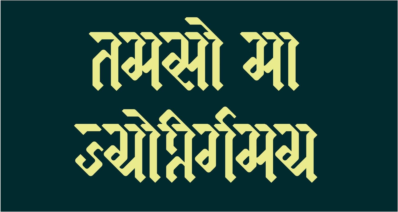
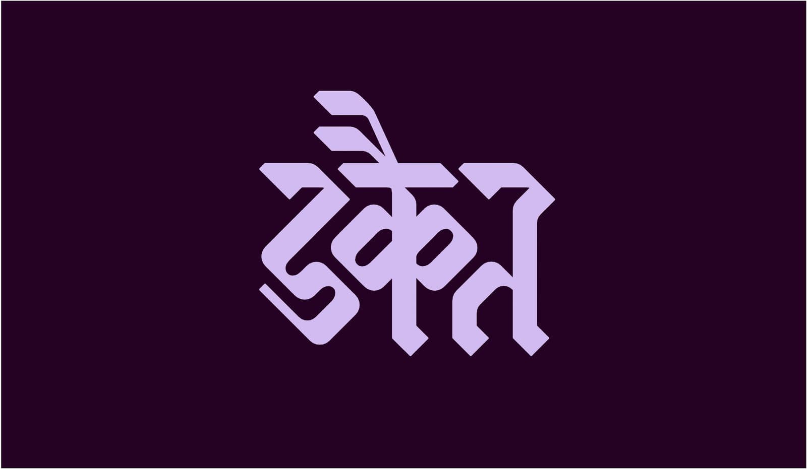
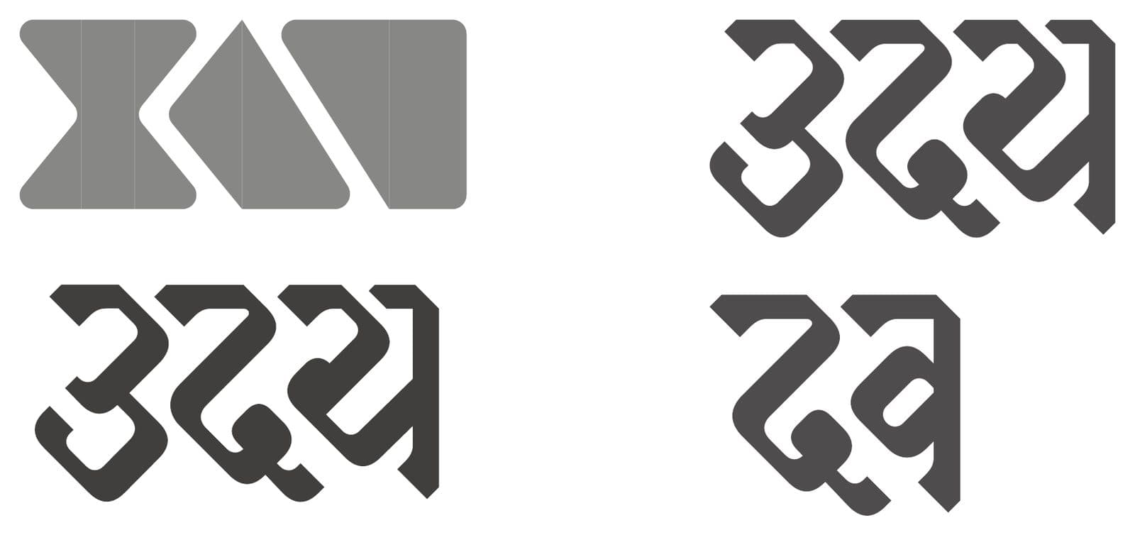
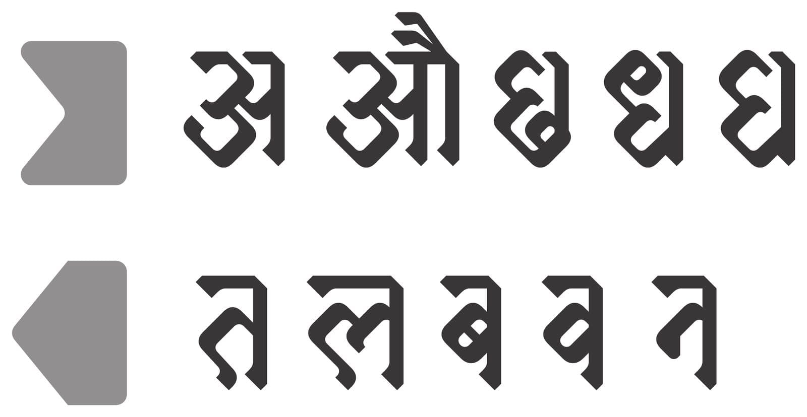
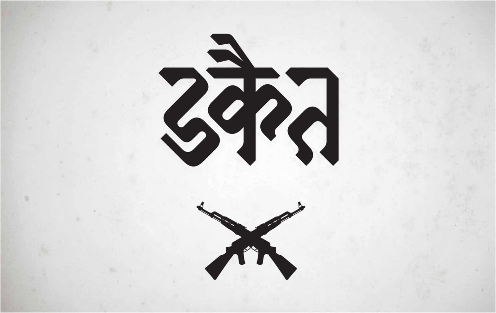
Then the jury spoke.
- The interaction between glyphs is so subtle that the surprise an interlocking font promises never arrives.
- The font is half-baked — where the system fails, there are no alternate glyphs to catch it.
- The visual feel drifted during development; the charm of the lettering got lost on the way to the font.
- Some glyphs look odd because the grid was obeyed when it should have been broken.
They were right on every count. I had a font. I no longer had the idea. So for Project III I made the call that felt expensive and was actually cheap: keep the question, discard the answer, start again.
Starting over, on purpose
Round two began with three corrections written on the wall: make the interlocking direct — forms of a letter may differ, as long as they're consistent. Balance every aspect at once — visual grammar, system, conjuncts, grey value. And go where the vertical space is.
A condensed skeleton gives Devanagari room to move: tall narrow glyphs, small ascenders and descenders, vertical space to spend on stacking and locking. New explorations tested that thesis.
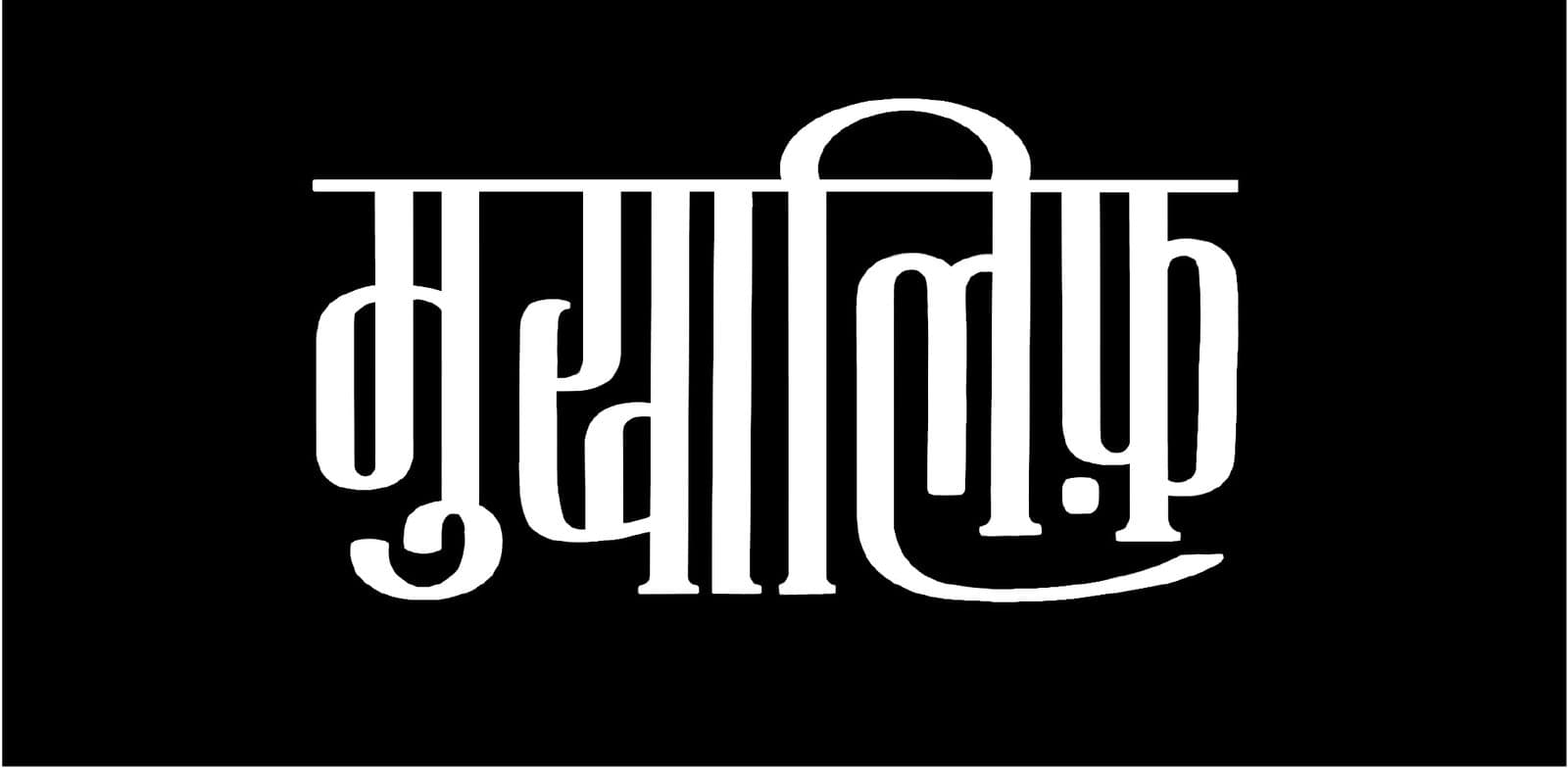
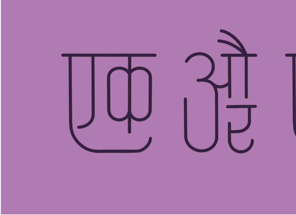
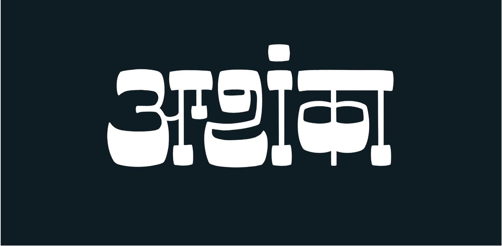
The most useful advice of this cycle: draw the basic glyph set first, define the system of interlocking second, then merge the two. One phrase tracked the whole journey from sketch to font:
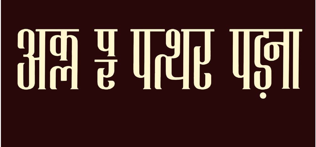
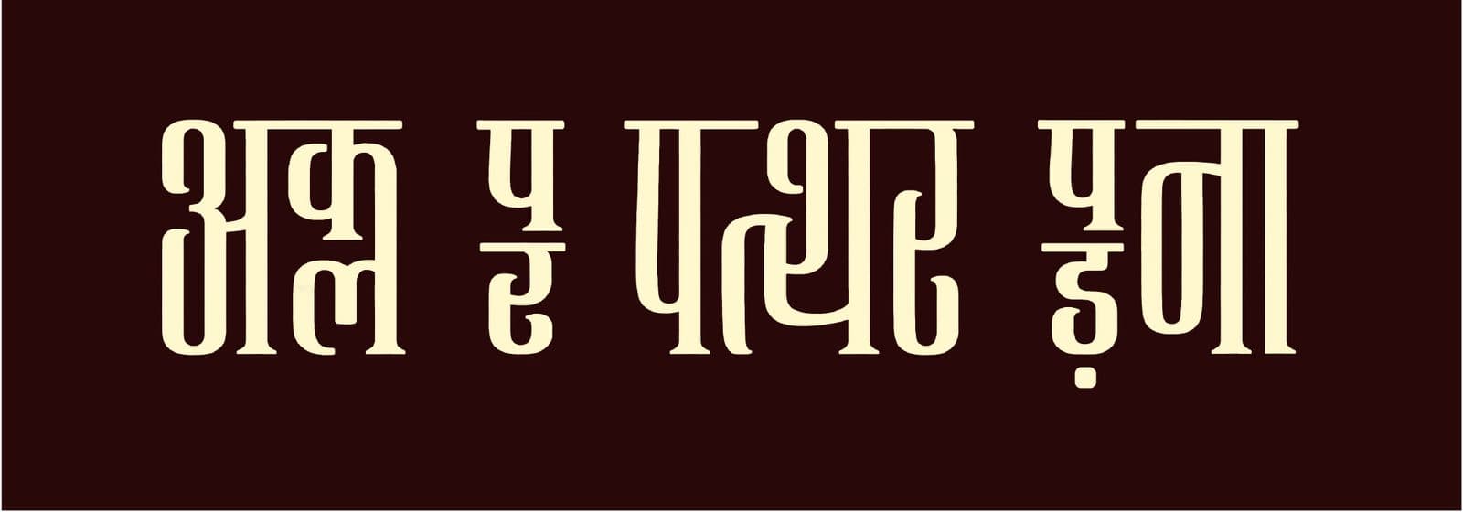
The system: rules before beauty
The core idea of the final font is that a glyph is not a shape. It's a set of states — compressed, extended, half-height — each optically corrected to look like one calm letter.
Interlocking then becomes arithmetic: n units of space created by one glyph must be filled by n units of another. A lock that leaves whitespace behind has failed at its only job.
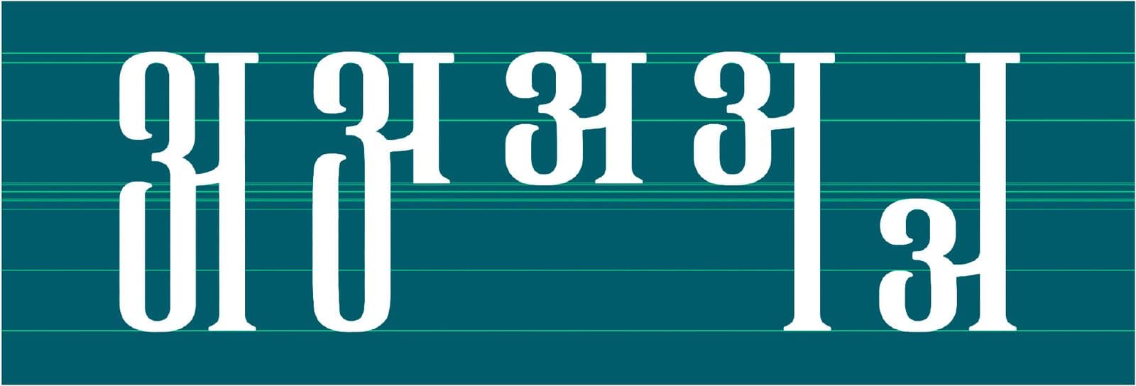
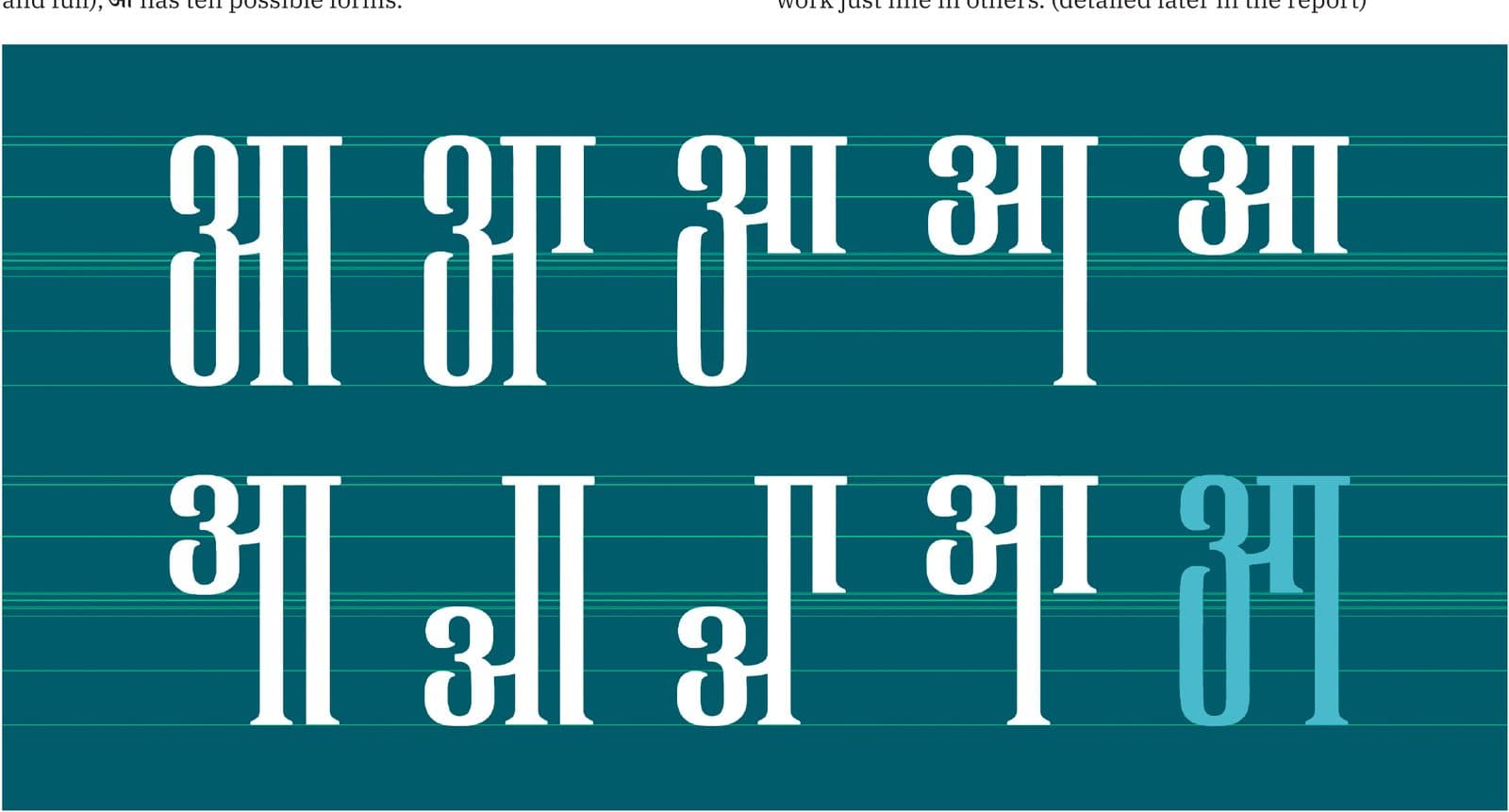
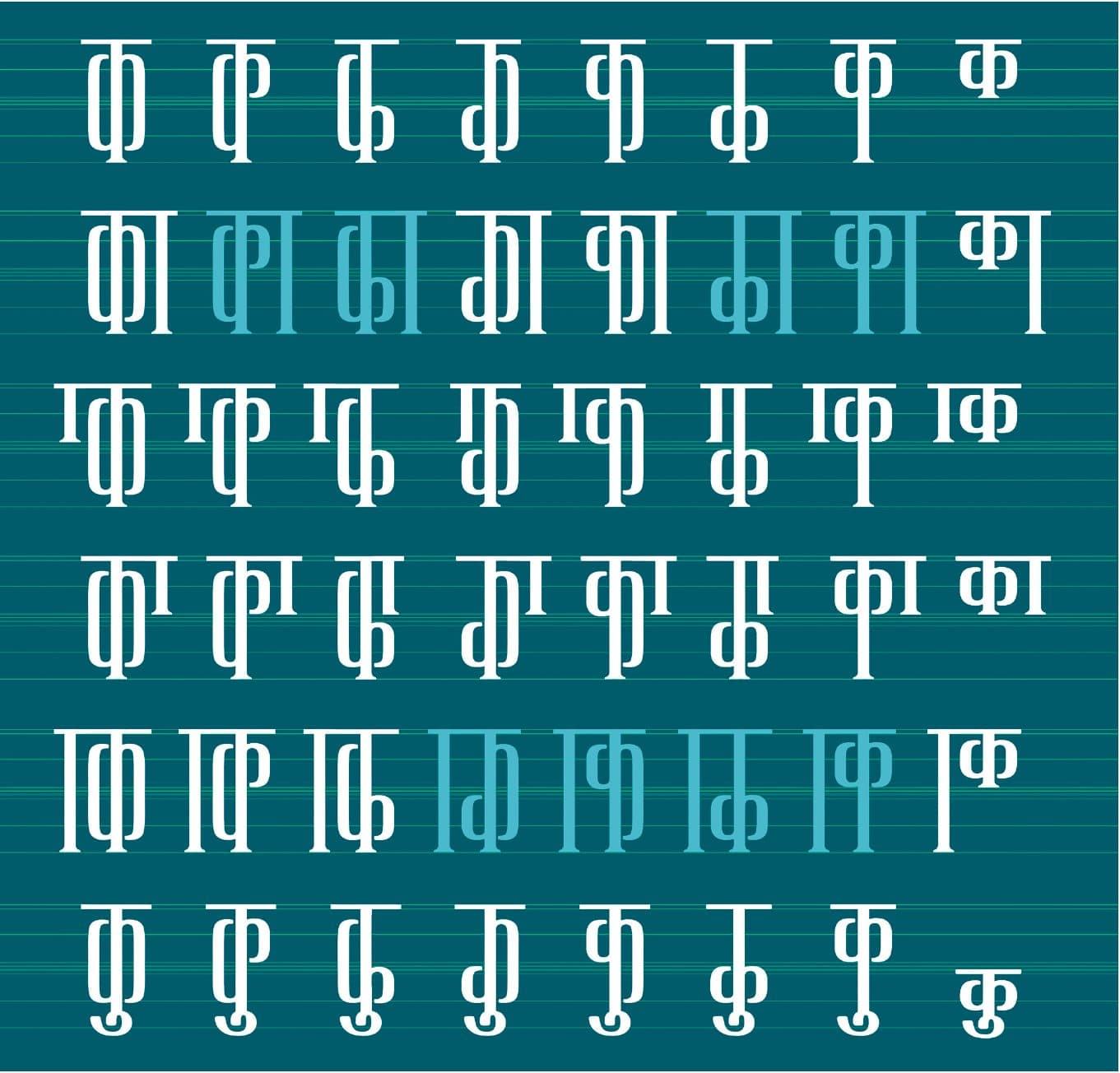
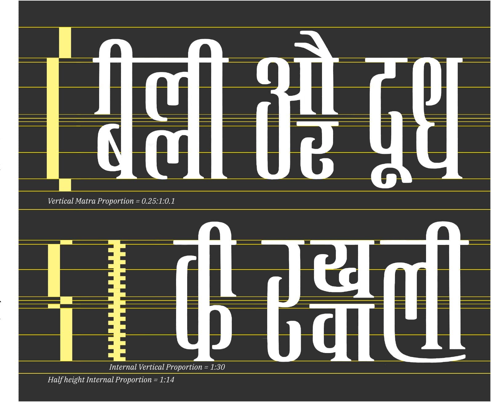
Four kinds of interlocking got names and rules. Watch one sentence — बिल्ली और दूध की रखवाली, "the cat guarding the milk" — go through all four:




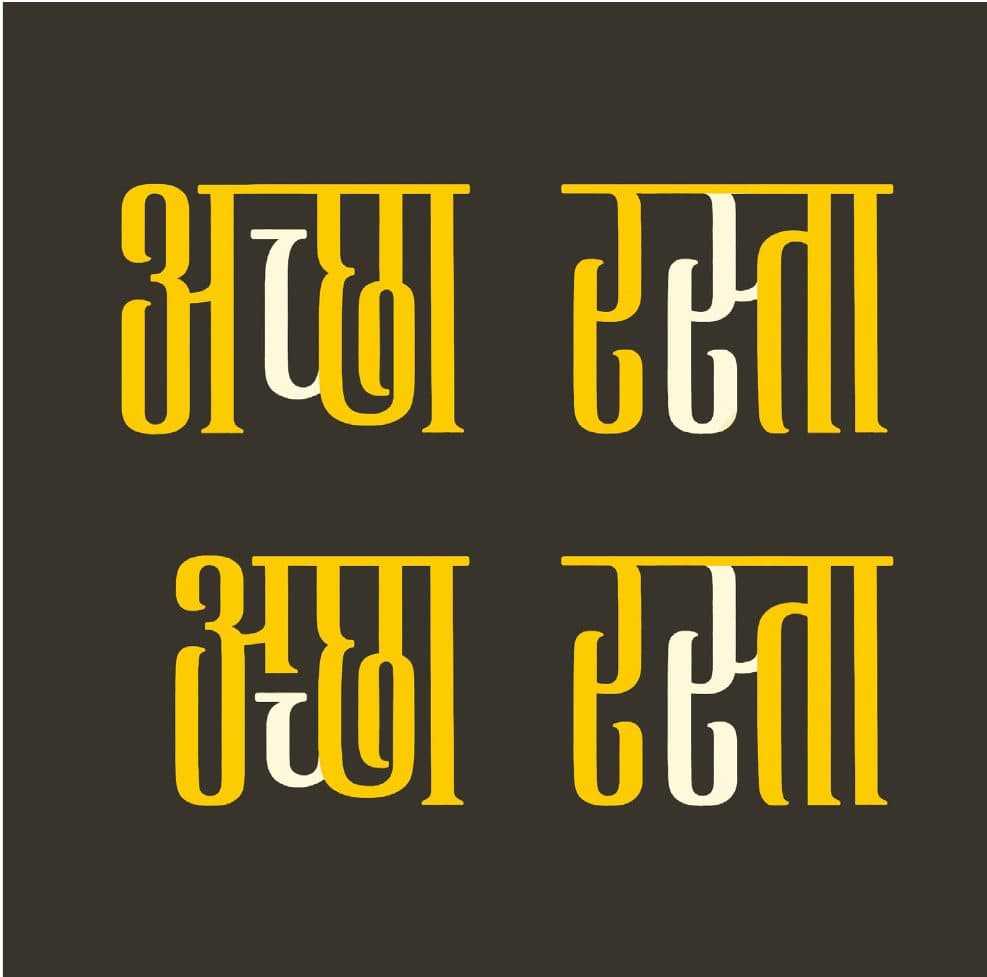
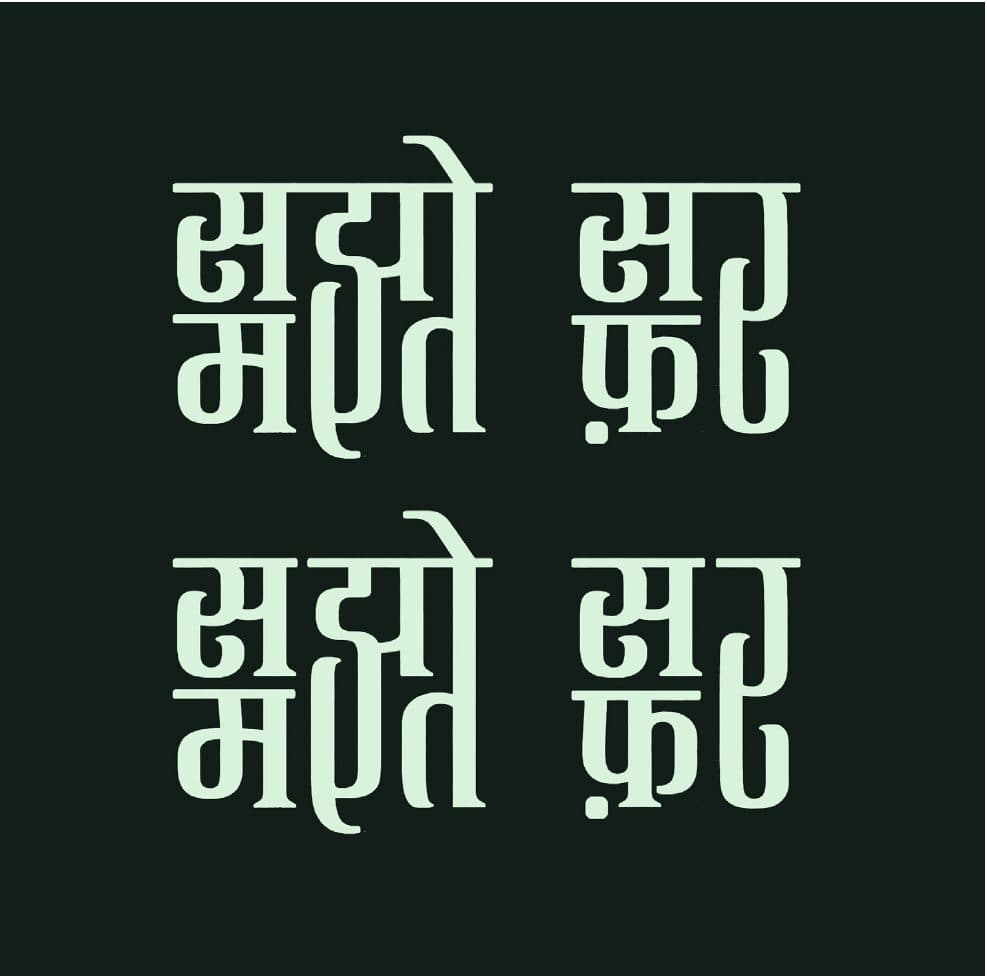
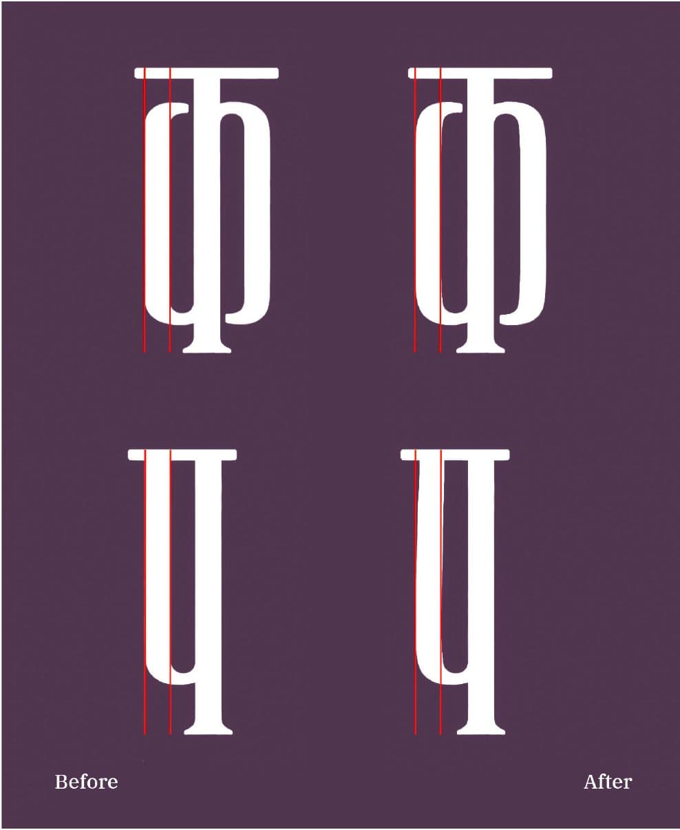
Underneath the system, quieter craft. Straight condensed stems turned oppressive in stem-heavy words — so every vertical got a barely-there curve, drawn as a tangent rather than a rounded rectangle. Its direction doubles as a legibility cue when letters lock. And a proportion grid holds it all: matra : body : descender at 0.25 : 1 : 0.1.
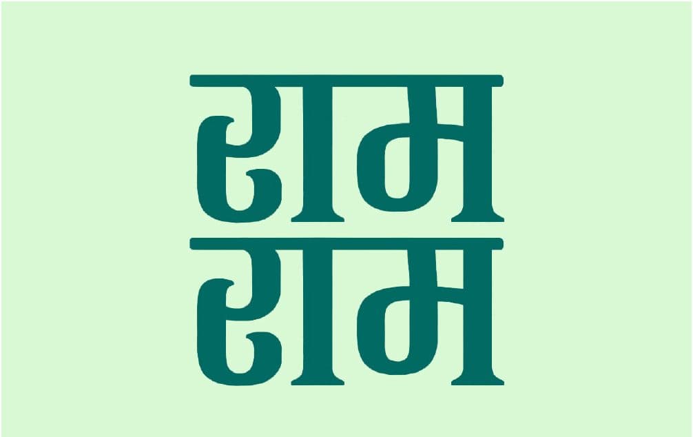
And a fourth category that breaks its own rules on purpose: contextual wordmarks — phrases so common they get coded as single words, free to interlock however they please.
One honest asterisk, kept honest in the report itself: with multiple states per letter, many words have more than one valid setting. I tried to derive rules for a single "right" interlock from first-time readers; the attempts were inconclusive. Verdict as shipped: it's the user's choice — pending a formal legibility study.

The typeface
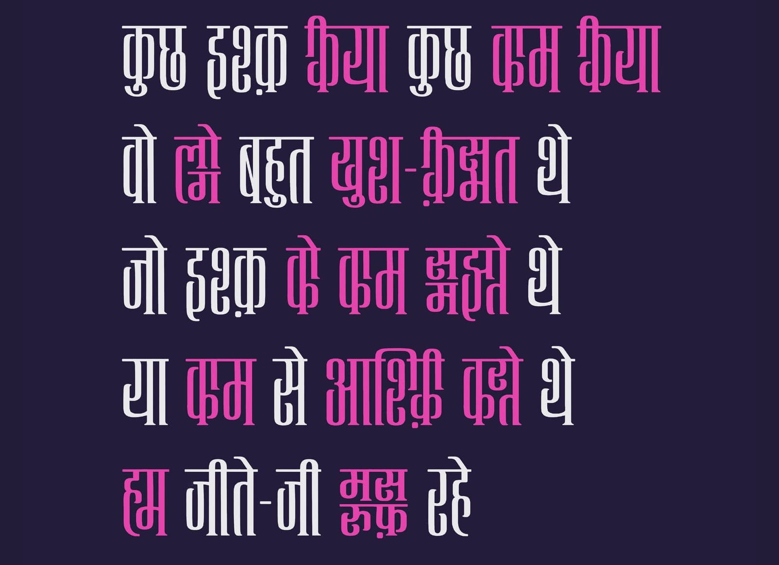
A condensed, humanist Devanagari display face. Medium contrast from a flat-cut pen. Open counters, squarish turns, dragged end-knots. Space saved without ever looking squeezed — elegant and casual were the two adjectives it had to earn.

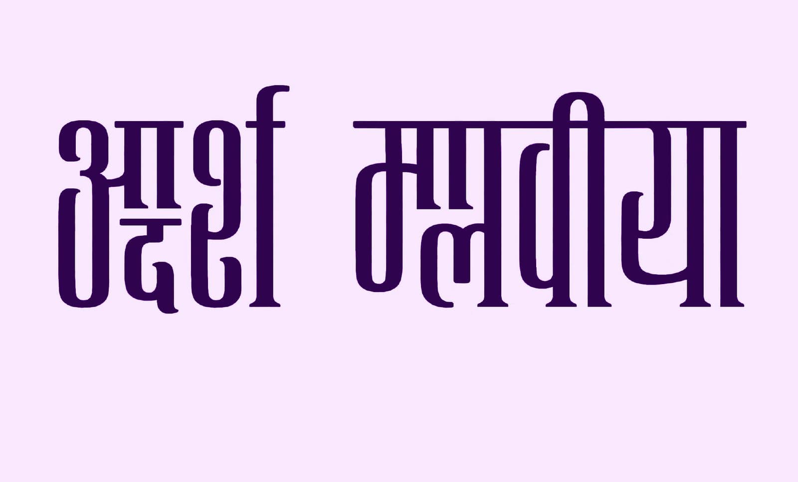
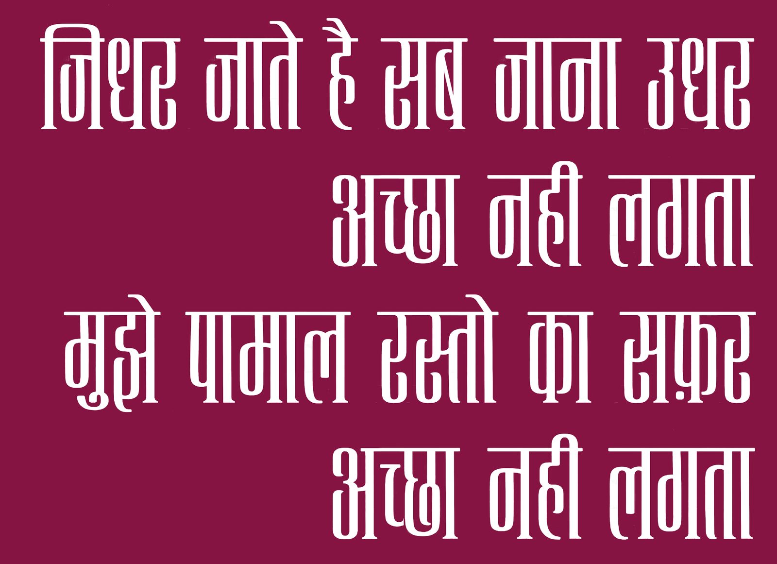
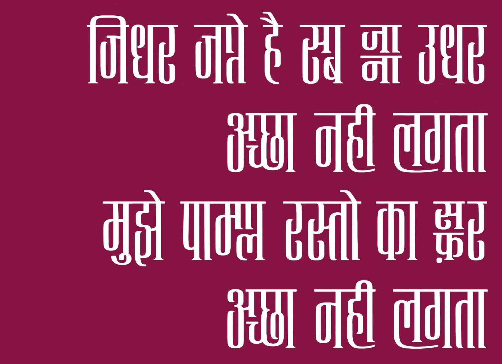
InteractiveNida Fazli's जिधर जाते हैं सब — first as plain condensed type, then with the system switched on. Same poem, same face; the texture is the feature.
Where it honestly ends
This is a thesis, not a retail release — and the report says so out loud. It was also selected as a paper at Typography Day 2021 and featured as a case study on D'source.
Still to do, documented as further work: glyph coverage beyond Hindi and Marathi; akhand conjuncts and dense clusters; kerning and texture under a formal protocol; and the study this font genuinely needs — measuring legibility and reading speed when readers meet unconventional reading patterns, so the rules can graduate from designed to proven.
What the project settled for me is bigger than the font: define the system first, and the beauty has somewhere to live. It's the same instinct I later brought to design tokens at a startup and a design system at Flipkart — just with pixels instead of pencils.
WatchTwo short films from the project — the conference talk and the case-study film.
Credits & record
Projects II & III, M.Des Communication Design